

Please look at your (panel) data

Acronyms I’ll use in this post:
DID: difference-in-differences
TWFE: two-way fixed effects
MAR & MCAR: missing at random & missing completely at random
DGP: data-generating process
panelView has a new look. The idea came from a separate project where I have been having AI generate panel-data figures; the outputs looked sharper than what panelView itself was producing, and that pushed me to refresh the package.
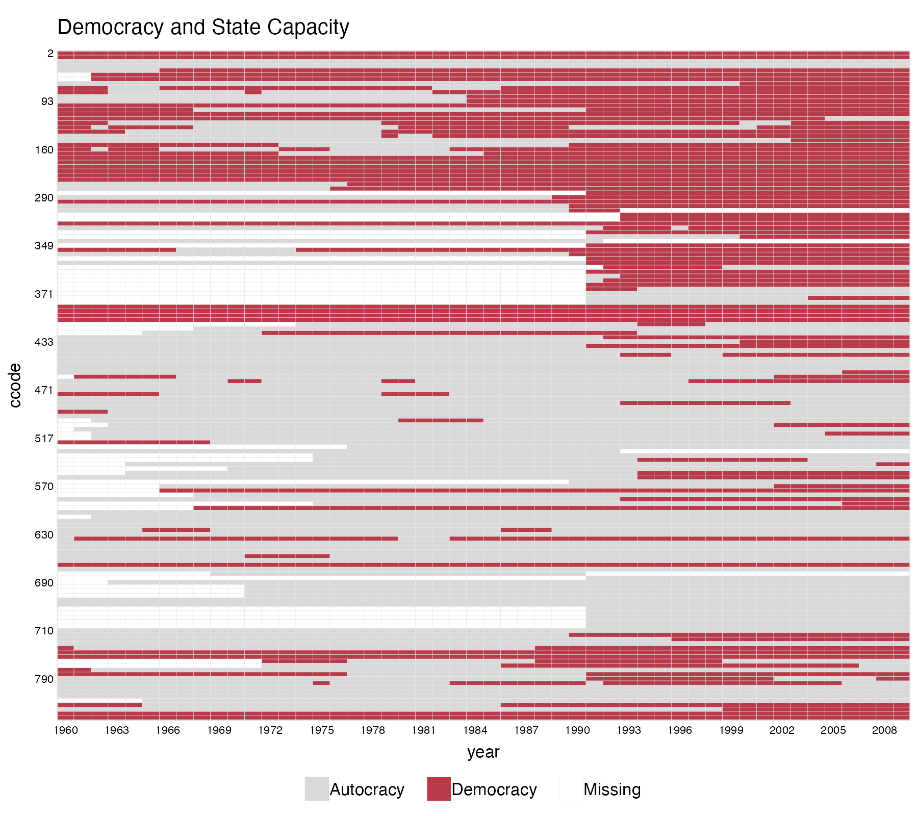
panelview(Capacity ~ demo + lnpop + lngdp,
          data = capacity, index = c("ccode", "year"),
          main = "Democracy and State Capacity",
          axis.lab.gap = c(2, 10), theme = "red",
          color = c(control = "grey85"),
          legend.labs = c("Autocracy", "Democracy", "Missing"))
History
panelView began as a spin-off of gsynth, now absorbed by fect. The R version was mostly written by Licheng; later, Hongyu wrote the Stata version. We then wrote this JSS article together.
When I was working on gsynth, I kept wanting answers to basic data-structure questions about each new panel I touched: How many never-treated units (pure controls) are there? How many treated units, and do they all switch on at the same time? How many pre-treatment periods do we get?
Gradually it became almost impossible for me to skip this step when starting on a new panel.
One convention has stuck: every cell must be uniquely identified by a unit-time pair. This is occasionally inconvenient, but I find it useful—it forces both me and users of the package to think clearly about the unit of analysis. That clarity turns out to matter for DID designs and for the “TWFE apocalypse” (a running joke on Twitter).
Probably around the same time, my friend In Song and his coauthors developed a similar function, DisplayTreatment(), in the PanelMatch package.
Not only should researchers make these plots, but such plots should also be provided to reviewers, who usually don’t have access to the data, so they can better understand what the authors are doing. Let me explain why.
Why look at the treatment pattern?
There are at least three reasons to look at the treatment status pattern before running any regression.
1. Understand where the identifying variation actually comes from. When I was taught classical panel methods such as random effects and fixed effects models, the model was the model, and we believed it applied to the data as a whole.
But with fixed effects, the coefficients we usually care about come from variation that remains after the fixed effects have been removed.
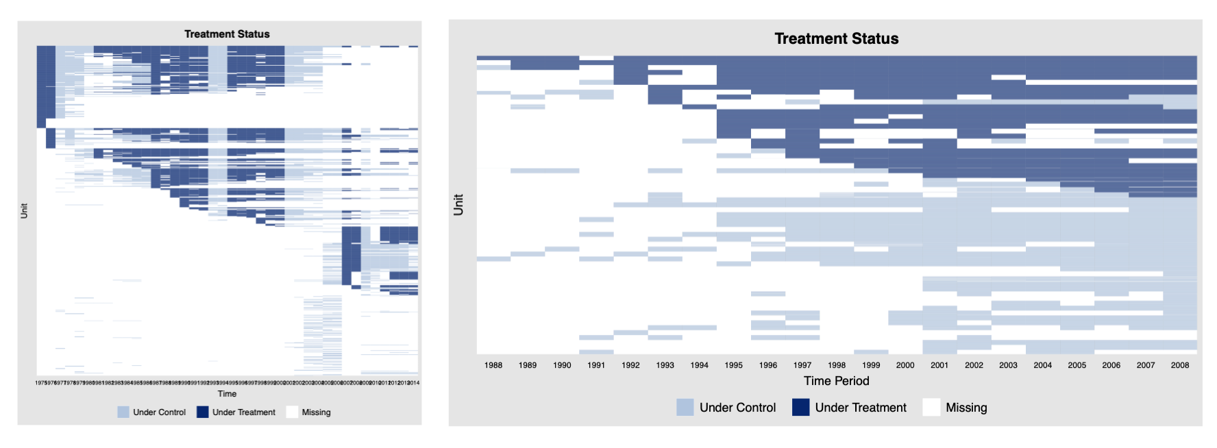
The figure above show datasets where variation is almost entirely confined to one dimension. Fit a TWFE model here and you will absorb nearly all of the treatment variation. The regression will still run, because the time and unit fixed effects do not absorb everything in the treatment, but the identifying variation left over is very thin.
Another issue is singletons—a singleton is an observation that sits alone in one of the fixed-effect groups. Because there is no within-group variation, it gets dropped and contributes nothing to estimation.
2. Gauge the effective number of observations. As we mentioned in the last piece, one of the key features of modern causal inference is a clearer articulation of the quantity of interest. With sharper thinking about estimands has come sharper thinking about what “sample size” actually means for a given target.
Take an extreme case. If we have one treated unit—and we care about the treatment effect on this particular unit (as in a synthetic control setting)—and 1,000 comparison units, the effective sample size is not 1,001.
Nobody agrees on a single way to calculate the effective sample size here, but it is certainly much smaller than 1,001 because much of the uncertainty in the treatment-effect estimate is driven by what happens to the treated unit itself, even when the counterfactual is estimated in the best possible way.
3. Comprehend the missing-data pattern. In social science we still treat missingness fairly crudely. In cross-sectional settings there are at least common routines—Amelia and its relatives—that handle the problem systematically.
For panel data the literature exists (for example), but there is no consensus method. Plotting treatment status alongside the other variables at least lets us see whether the estimates have something to stand on, or whether they will rest on very thin air.
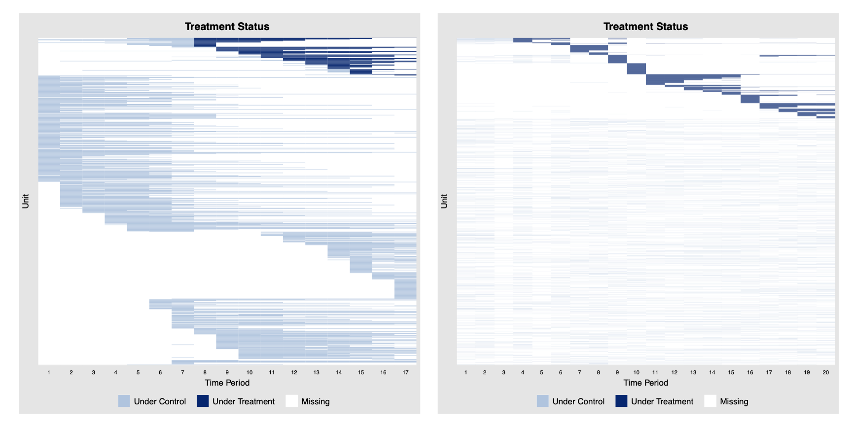
The above panelView plots show severe missingness. Looking at a pattern like these immediately makes me nervous. Missingness could be systematic, and the assumptions needed to ignore it, such as MCAR or MAR, are often much stronger than researchers acknowledge. I would be very cautious about interpreting any results as reliable causal estimates when the treatment-status pattern looks like that.
An important clarification: the treatment status plot ≠ treatment assignment, let alone a design.
For example, with observational data, I tend to think of staggered adoption as a setting rather than a design, because the same treatment pattern can emerge from very different assignment processes.
Please don’t use the term staggered adoption design unless you are running a stepped-wedge trial (Professor Don Green pointed out this connection when I visited Columbia years ago; also see this widely-cited paper by Susan and Guido). We will come to this later in a different post.
A new feature: which cells actually participate?
Given the popularity of the new generation of DID estimators, I have been wanting a way to visualize which cells in the dataset are actually participating in estimation, and which are not.
Now that the implementation cost is so low, I gave it a shot the other day. Currently, it works for both fect and PanelMatch.
Take PanelMatch as an example. Once we fix a number of pre-treatment periods (the matching window) and a number of post-treatment periods (the lead), only a strict subset of the panel ends up contributing to the estimate.
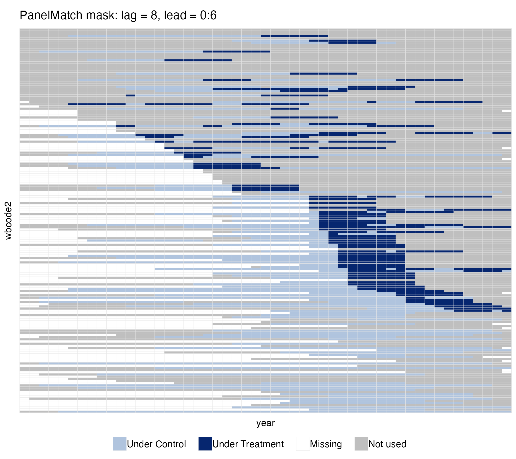
pm_wide <- PanelMatch(panel.data = pd, lag = 8,
                      refinement.method = "mahalanobis",
                      covs.formula = ~ I(lag(tradewb, 1:8)),
                      size.match = 5,
                      qoi = "att", lead = 0:6, match.missing = TRUE)

panelview(data = pd, formula = y ~ dem,
          index = c("wbcode2", "year"), type = "treat",
          by.timing = TRUE, sample = pm_wide,
          main = "PanelMatch mask: lag = 8, lead = 0:6",
          axis.lab = "off")
Without seeing it, researchers—myself included—struggle to picture which data are actually driving the results.
Other uses
panelView has a couple of other utilities I use often:
plotting outcome trajectories,
plotting bivariate relationships between an outcome and a covariate, and
plotting singletons.
My impression—without hard evidence—is that users rarely reach for these. Partly because once the dataset gets large, the plots become hard to read. I am still figuring out how to improve that, so suggestions are welcome.
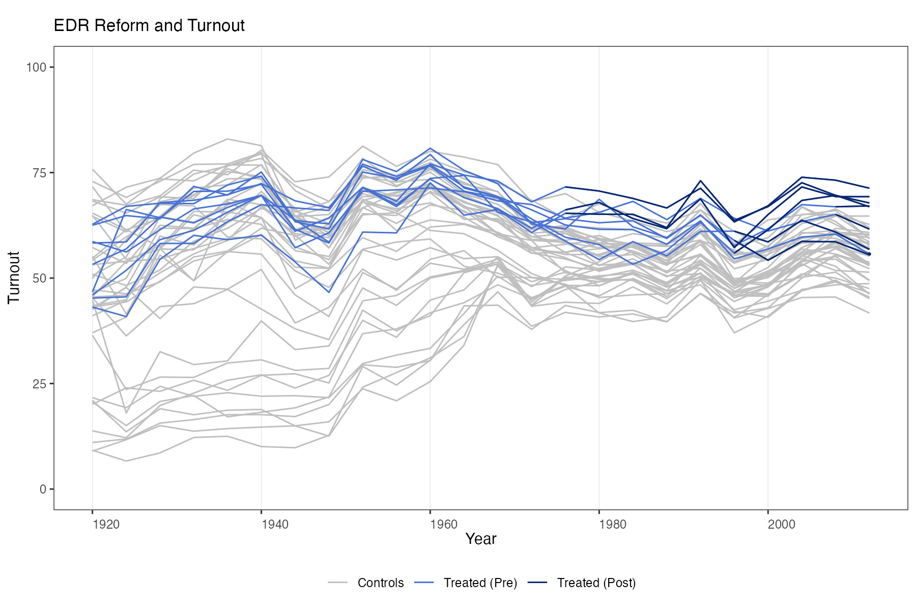
Outcome-trajectory plots (like the figure above) help with at least four things: (a) the distribution of the outcome; (b) whether there are wild outliers; (c) overlap between treated and comparison units (important for credible causal analysis); and (d) temporal persistence.
On the last point, two comments.
First, if the time series looks very smooth, I start worrying about persistence. Sometimes that means non-stationarity, sometimes it does not, but either way it tends to matter for both modeling and inference. We will come back to this in a later post.
Second, many real time series contain a lot of zeros, which can strain some of the modeling assumptions we routinely make—for example, factor models may be a poor approximation for such DGPs.
Even on a small subsample of the data, visualizing the outcome is usually worth the few seconds it takes.
I will return to the singleton plot when I write about modern algorithms for high-dimensional fixed effects.
In sum
Visualizing data should be routine. It is not always so in the social sciences. When I have not looked at my data, I have little imagination about the DGP. No model, however good, can fix that.